Client
Darkbeam
Project
Brand and website update
Client
Darkbeam
Project
Brand and website update
Deliverables
Logo
Branding
Website
Printed collateral
A fully automated cyber security platform, measuring and assessing risks whilst mapping to MITRE ATT&CK.
Problem
The current brand no longer reflected the company, its aspirations or its target audience.
Question
If a user came to Darkbeam’s website for the first time, would they get an idea of what they do and in the competitive cyber intelligence platform market, would the user feel that they were making the best choice?
Research
Market research into our competitors and broader tech sector allowed us to compare key market metrics that helped identify differences between its products and services and those of its competitors.
It enabled the company to revaluate and subsequently redefine its value proposition and get a better understanding of its unique selling point.
Solution
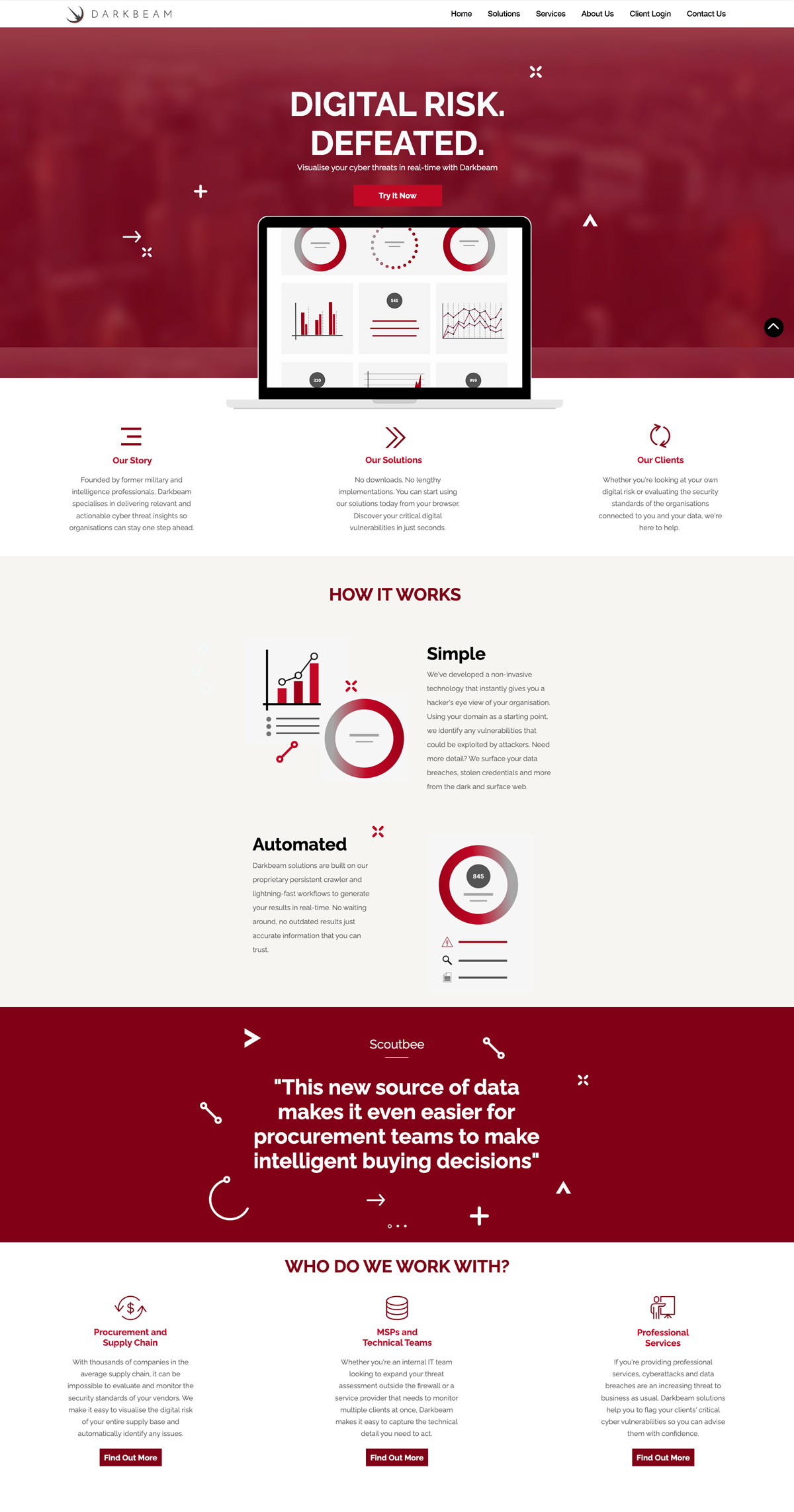
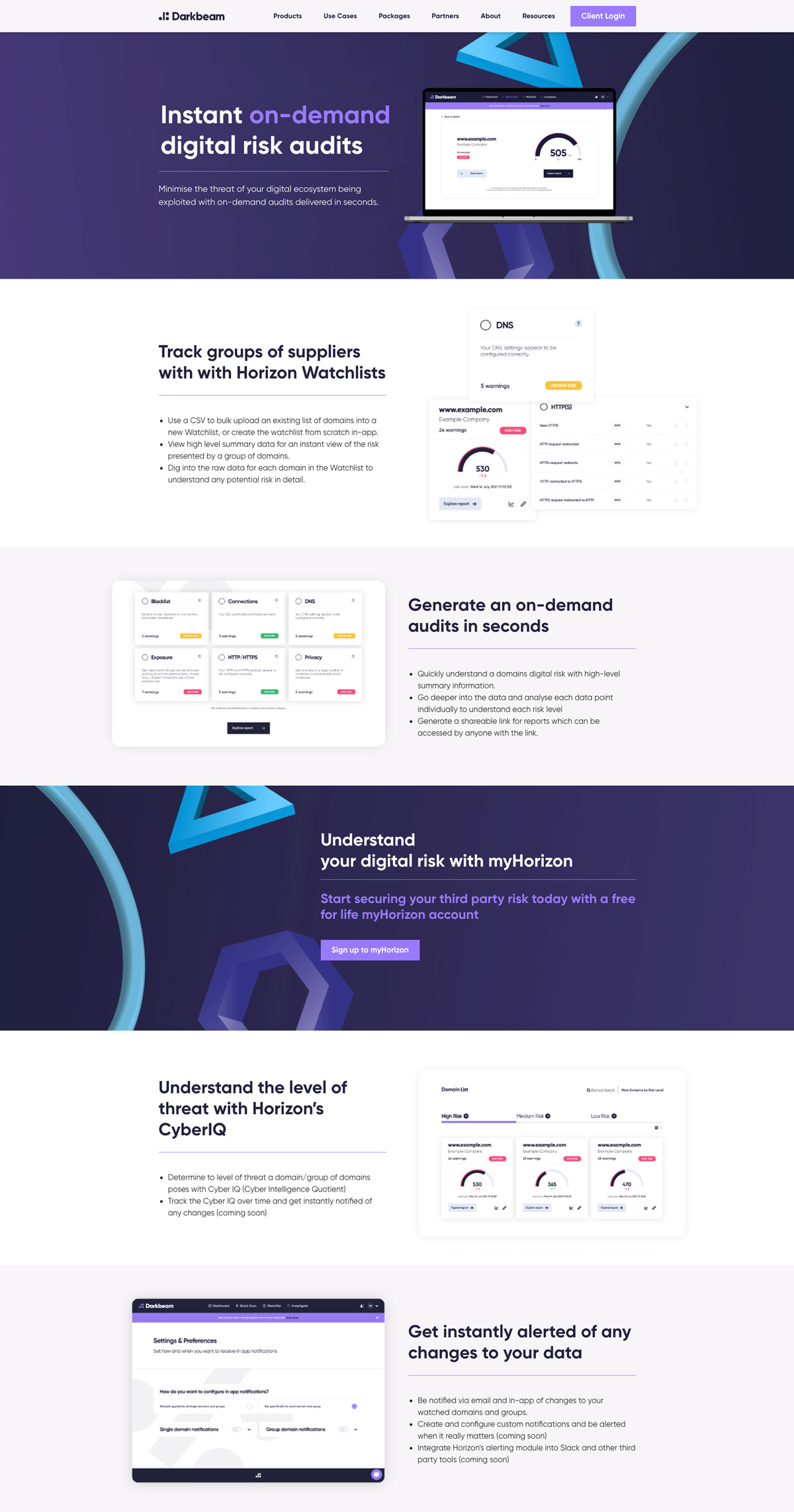
The brand itself required updating to reflect what its audience were expecting from a modern day tech company specialising in cyber.
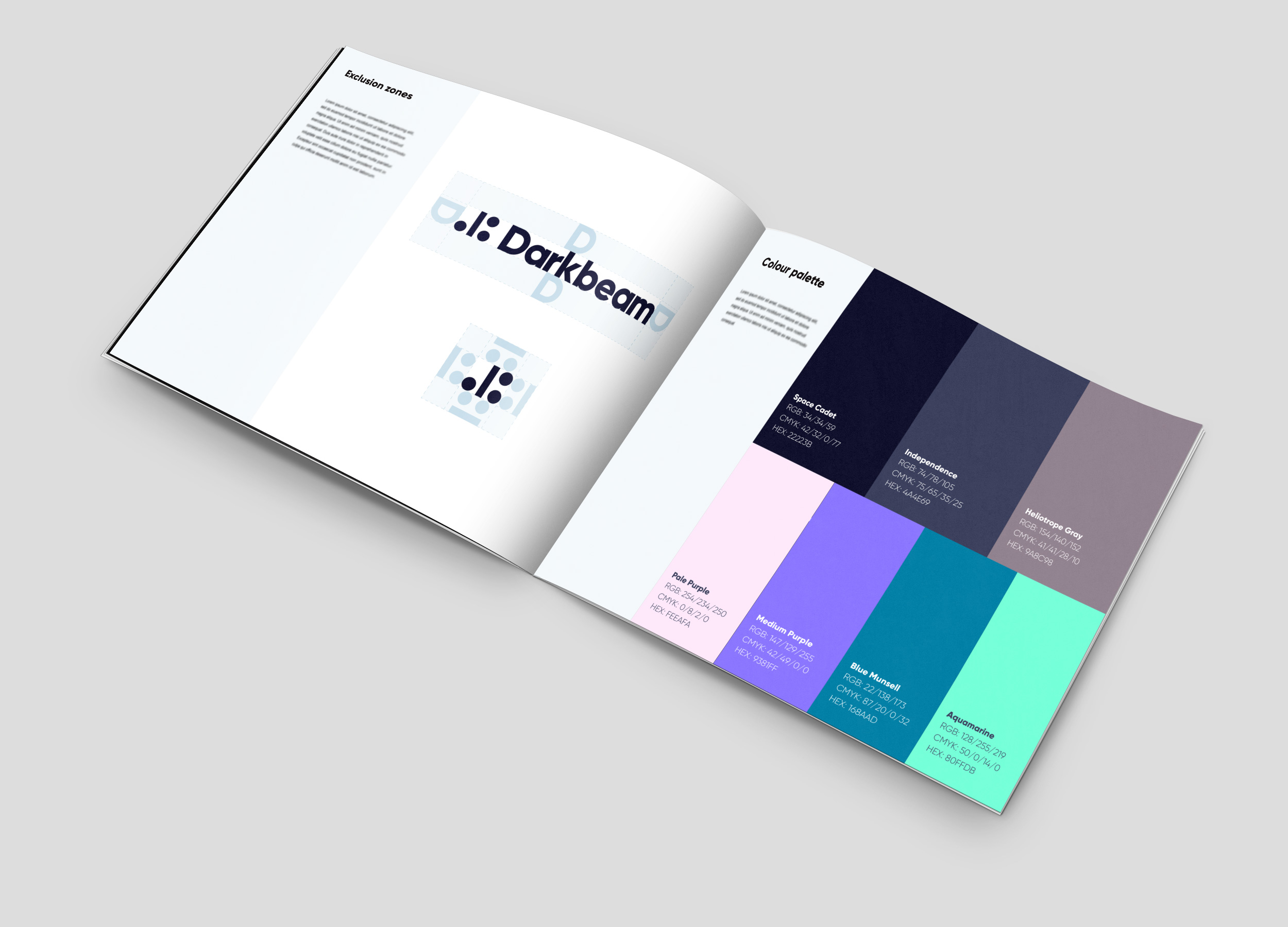
A new logo, colour palette, website and collateral were created along with clearer definitions on its imagery and tone of voice.

#22223B
#4A4E69
#9A8C98
#FEEAFA
#9381FF
#168AAD
#80FFDB
Gillroy Extrabold

Gillroy Light


Old
New
Result
By modernising the brand and reflecting its target audience they looked the part but by displaying more of the actual product and clearly displaying and promoting both the benefits of the product but it’s ease of use encouraged potential customers to contact the sales teams.
I’ve had the pleasure to work on a great number of projects, but some of them can’t be shown publicly. Please feel free to get in touch if you’d like to see something that isn’t here.


