Client
FirstCar
Project
Website relaunch
Client
FirstCar
Project
Website relaunch
Deliverables
UX/UI
Mobile
Development
Art Direction
Helping new and young drivers get on the road by providing advice on car buying, insurance and road safety tips.
Problem
FirstCar was unable to improve monetisation in their site despite large marketing budgets and regular content being created.
Question
Why is the site is underperforming and what can our users and the existing data tell us?
Research
From looking into Google Analytics, it was clear that the vast majority of users were initially accessing the website on their mobile, with returning customers later viewing the site on their desktops.
As the target audience for the FirstCar is 16-21, this wasn’t surprising but did highlight that the site wasn’t giving the best mobile first experience. Users were looking at the site on the go and then having to come back, if at all, on their desktops to properly access the content.
Solution
A UX audit was commissioned for the existing site which uncovered many accessibility issues such as: poor load times, too much organised content which confused and overwhelmed its users who were new to driving, poor colour contrast and centralised text to name just a few.
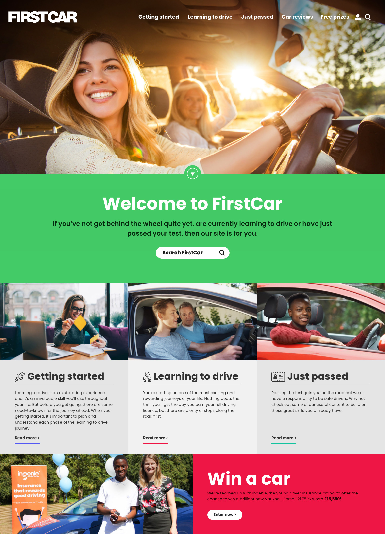
A new approach and design were needed. A mobile first approach was taken due to the nature of its audience and the data. By creating a new design, it meant that all of the accessibility issues could be addressed as well as the main customer problem; monetisation.
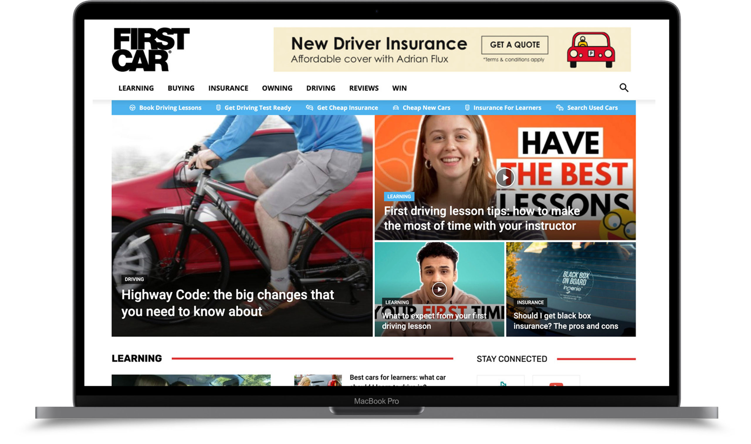
The redesign allowed for targeted advertising to be placed around key areas of the site, driving a regular revenue stream. However, the core of its revenue comes from directing users to third-party services via it’s secondary but prominent navigation.
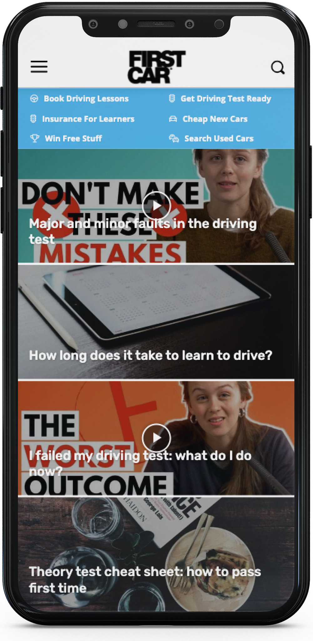
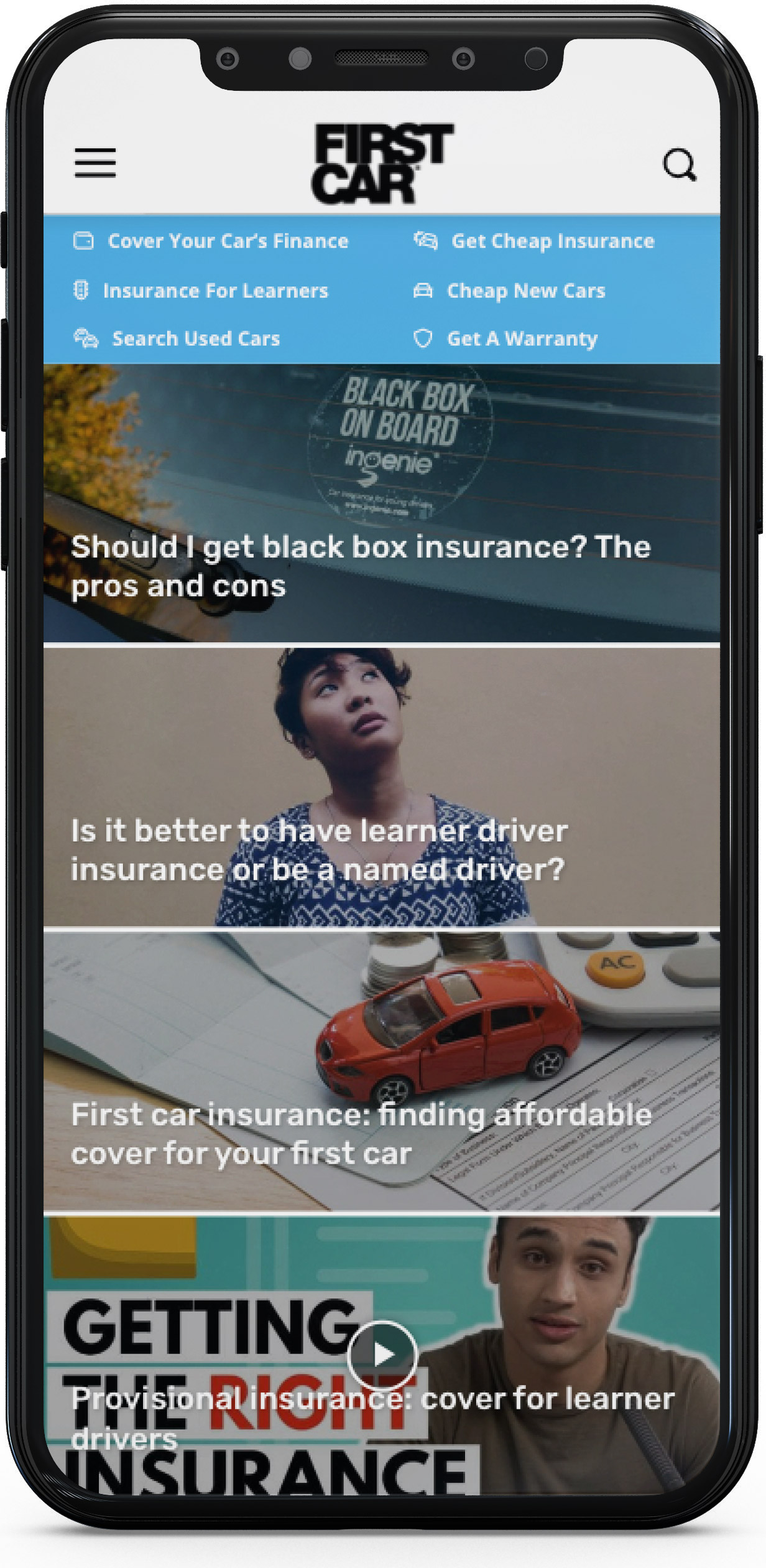
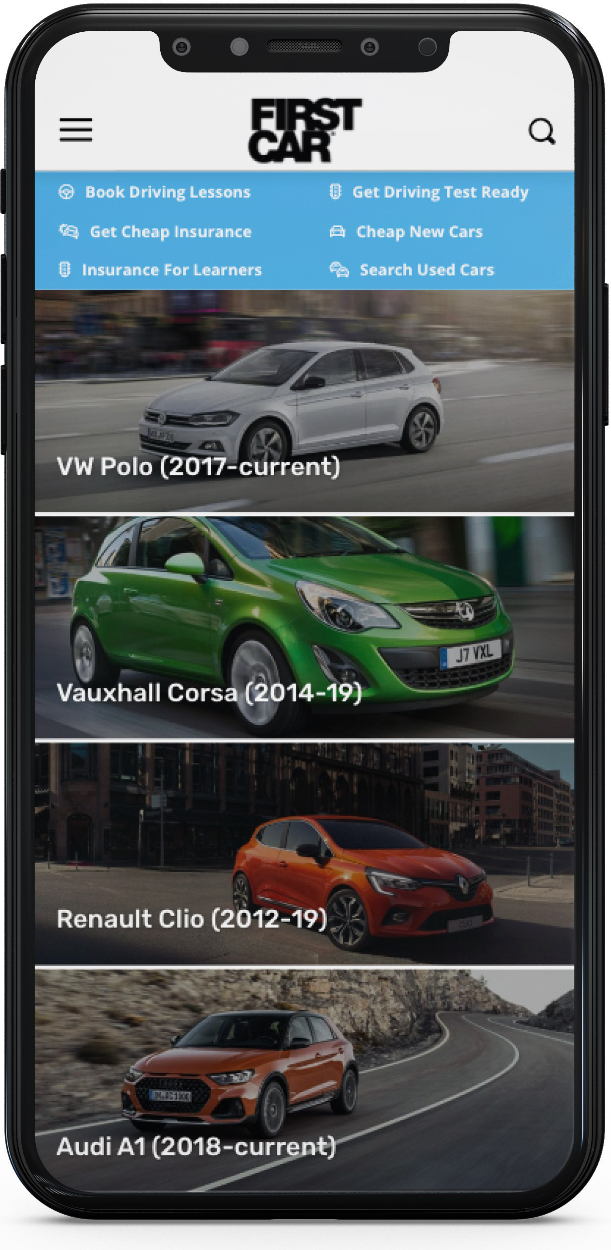
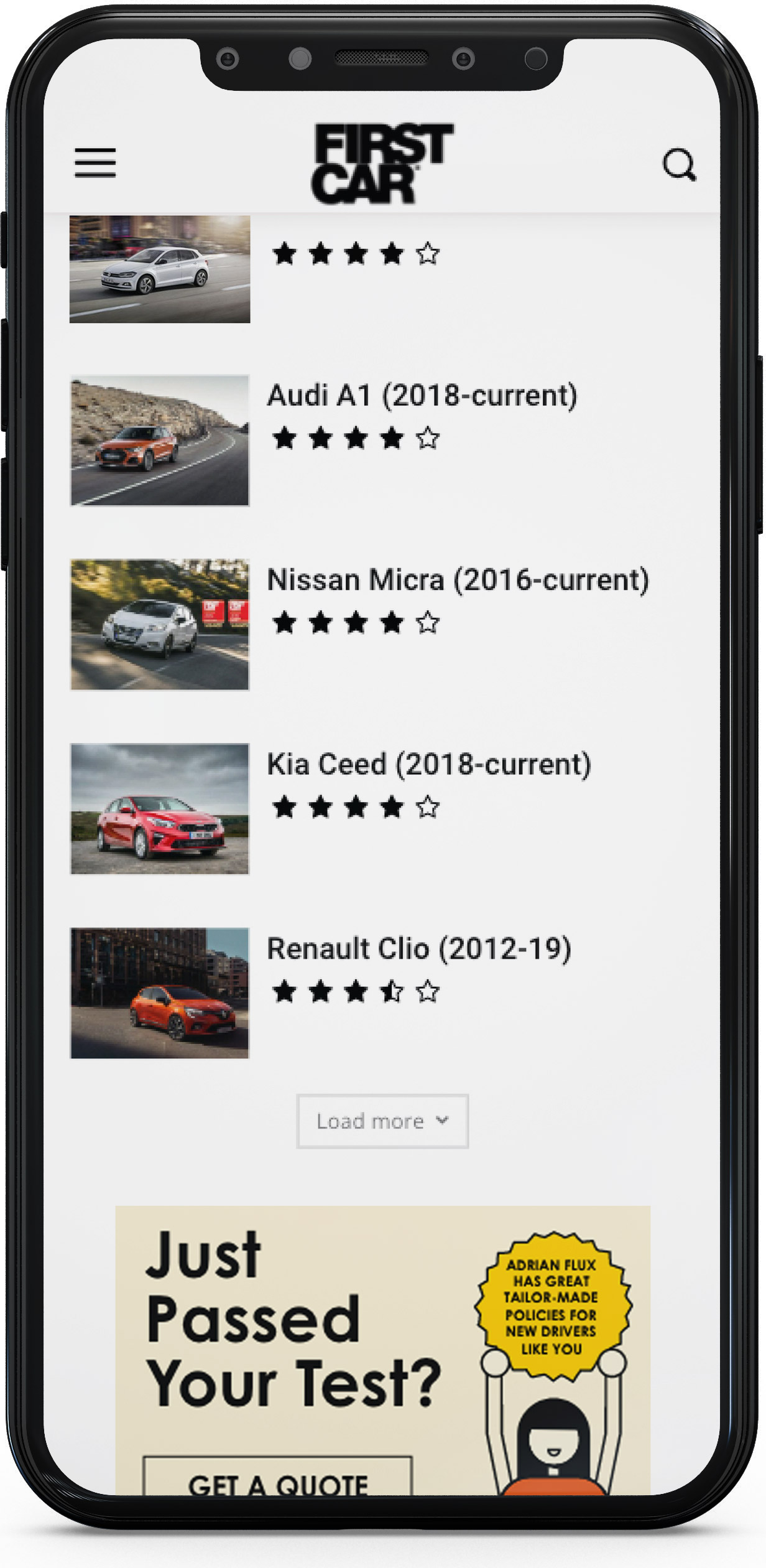
Visual language
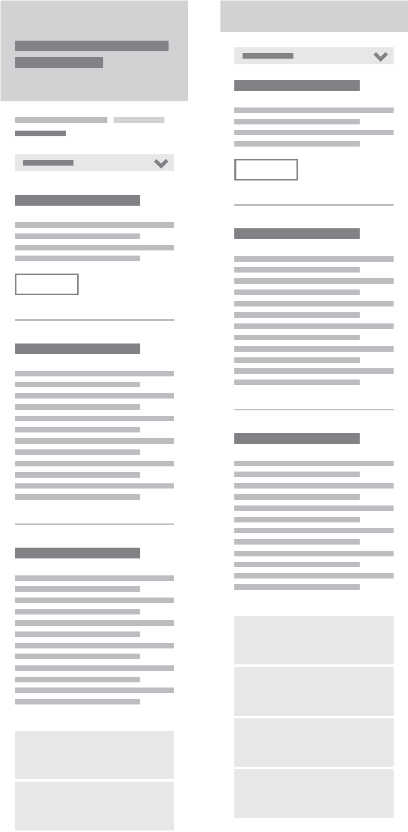
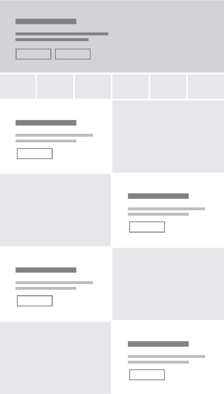
The essence of the original site remained with the use of descriptive headlines and bright colours but the addition of sub categories and breadcrumbs created a clear hierarchy and made the user experience much more enjoyable.
A vibrant blue became the brand colour as well as the actionable colour for navigation and buttons.
Photography was introduced along with regular and consistent videos to keep the content fresh and relevant.
Conclusion
By addressing the real problem of lack of accessibility by designing for mobile and utilising a page builder style WordPress template, the site can now be easily managed and updated.
User uptake as well as its earning potential has been greatly improved, while page load times have been decreased.
By having a website that visually changes daily, due to new content, the site always feels fresh and inviting. Offering new and captivating content for both new and returning users.
From the client
“I was impressed with his creative vision and skill, but mostly by his ability to problem-solve issues as they arose. We worked together to choose a template and then Lee worked with our freelance developer to customise everything ready for us to use.
It’s not often you find a designer who understands the complexities of web development and site structures, so Lee was a breath of fresh air and helped make the user journey clean, simple and effective.”
James Evans
Founder & Managing Director
FirstCar
I’ve had the pleasure to work on a great number of projects, but some of them can’t be shown publicly. Please feel free to get in touch if you’d like to see something that isn’t here.

