Client
RAC
Project
E-commerce optimisation
Client
RAC
Project
E-commerce optimisation
Deliverables
UX/UI
Mobile
E-commerce
Focus groups
Sprints
As one of the UK’s largest breakdown and recovery businesses they offer security and peace of mind to their millions of customers.
Problem
Improve their checkout completion percentage from 85% to 95% for mobile users.
Research
User testing objectives were established to better understand the following:
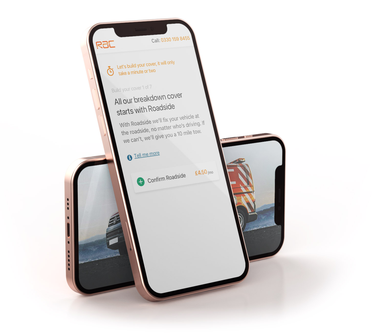
The analytics suggested that manny users dropped off before answering the first question but the vast majority that did start, went all the way through and answered all the questions.
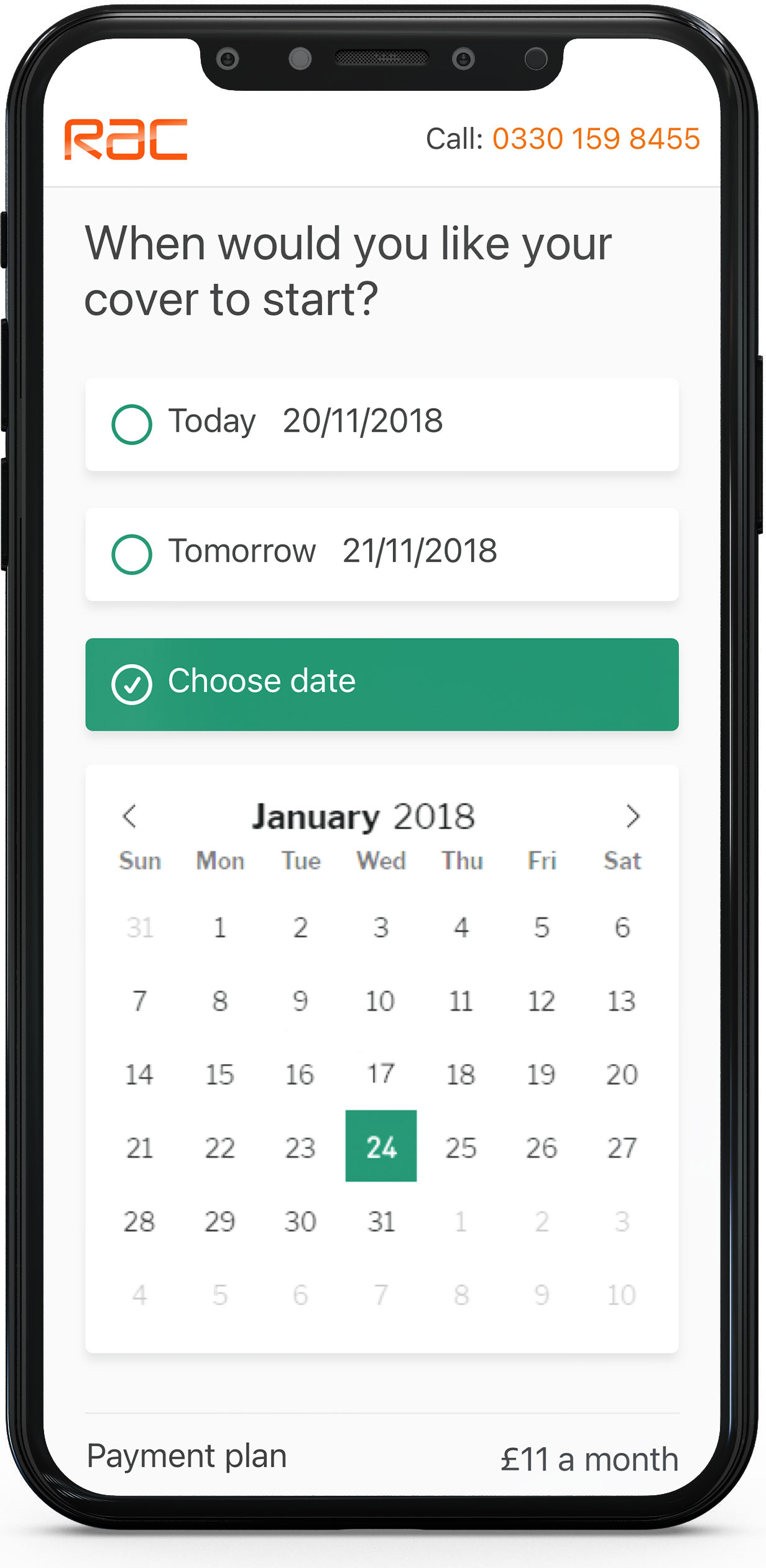
The section “More info” was regularly clicked on before or during the first question, due to users feeling unsure of this step – what the cover was and what they were being asked to do.
Solution
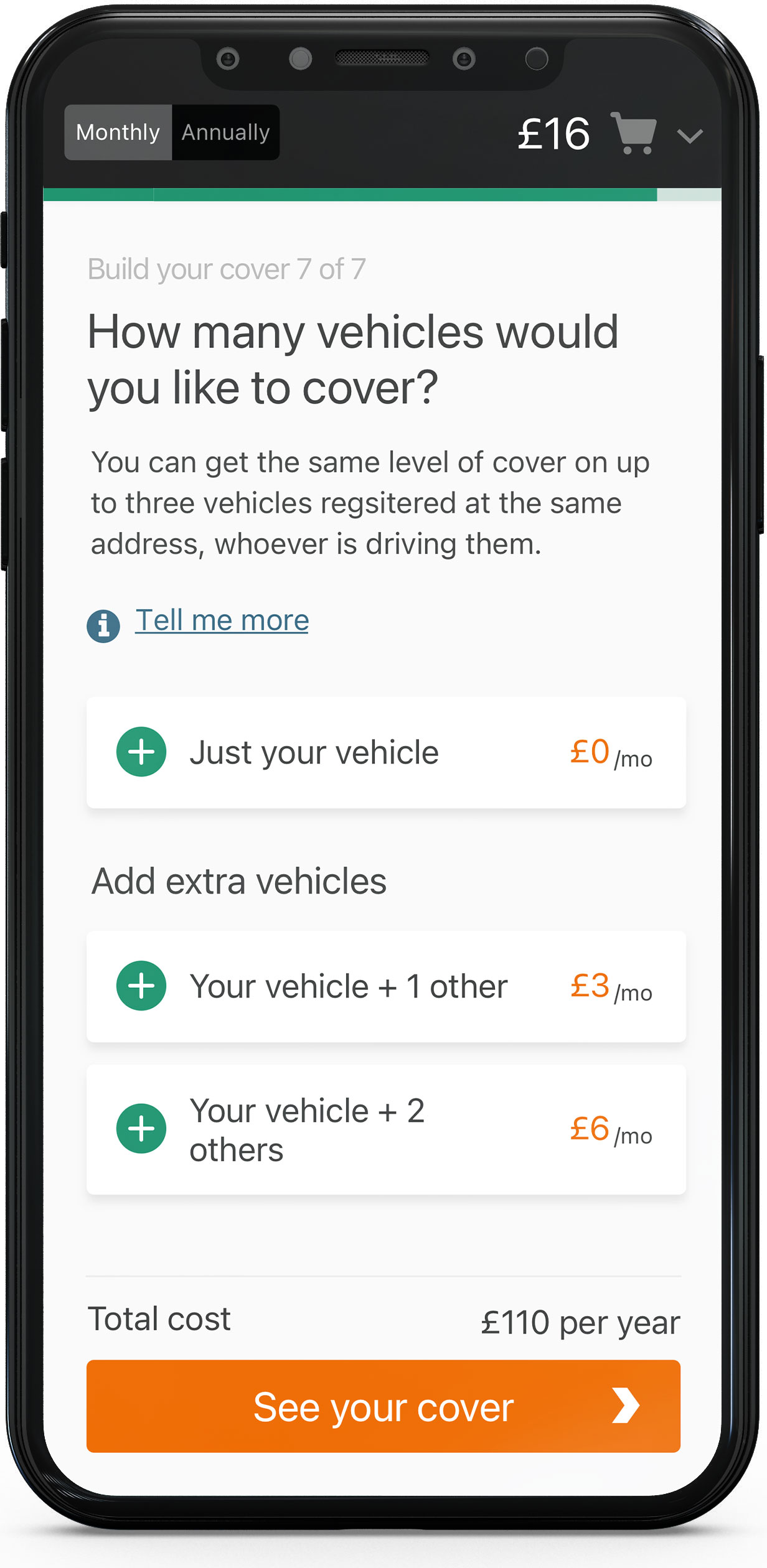
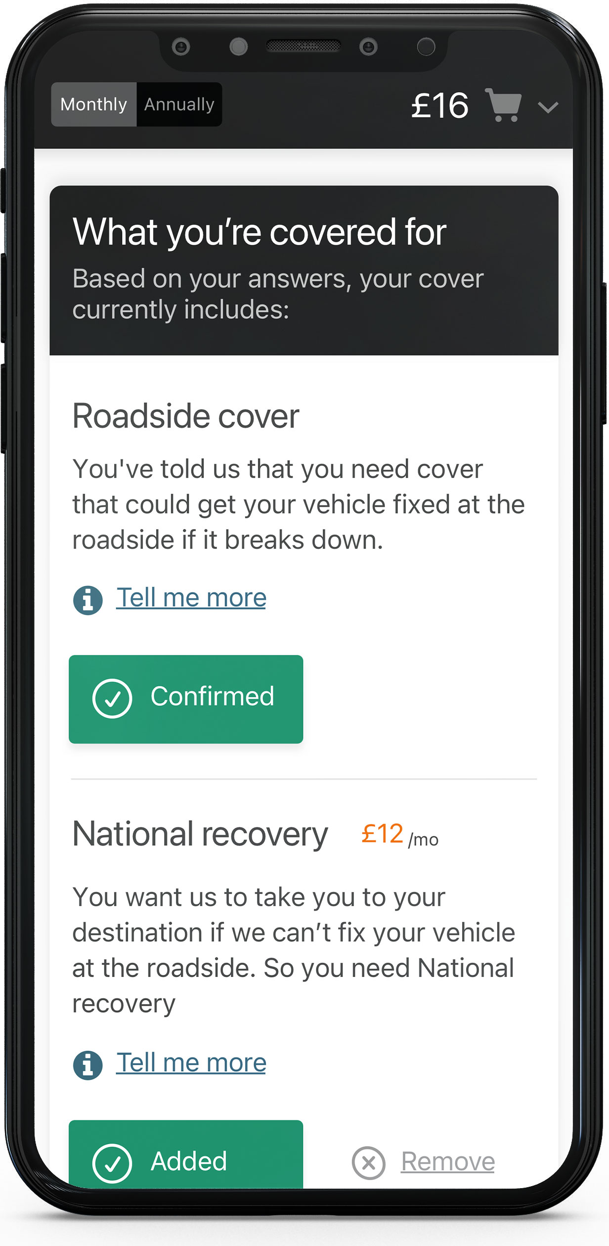
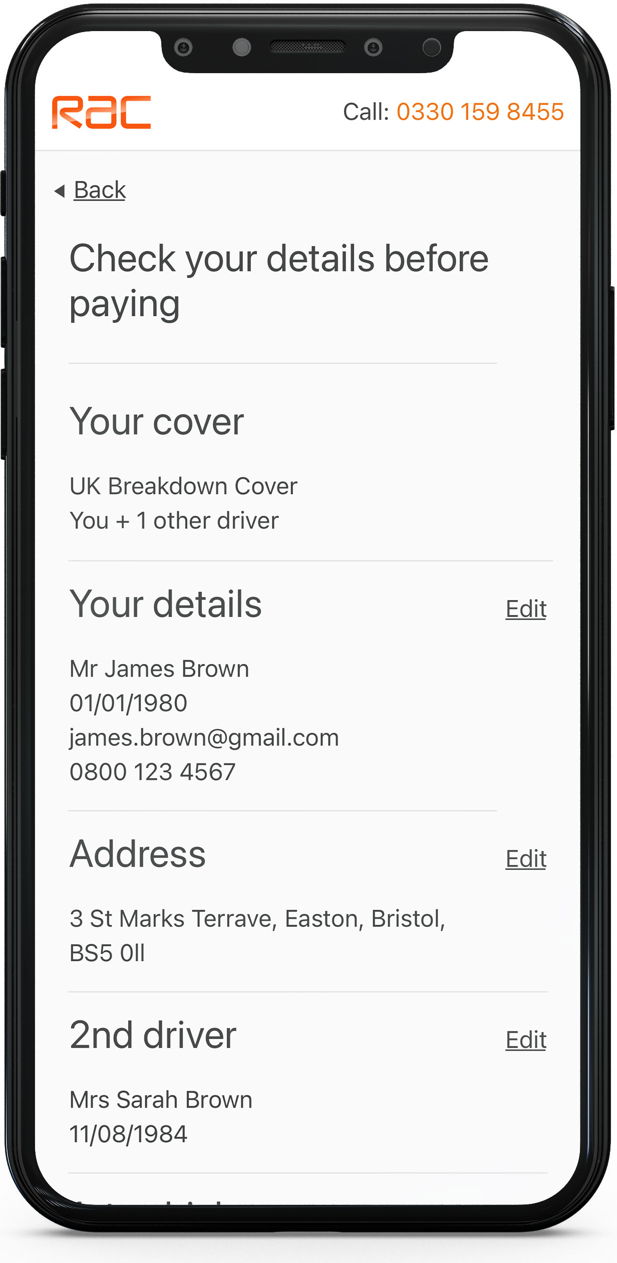
What the research highlighted was that many people were confused with the terminology and coverage of certain offerings. They would add or not add certain items to their basket but when asked, would not be able to explain what they were buying and whether it was correct for them. This highlighted a clear and obvious issue that could be corrected in both the language and UI.
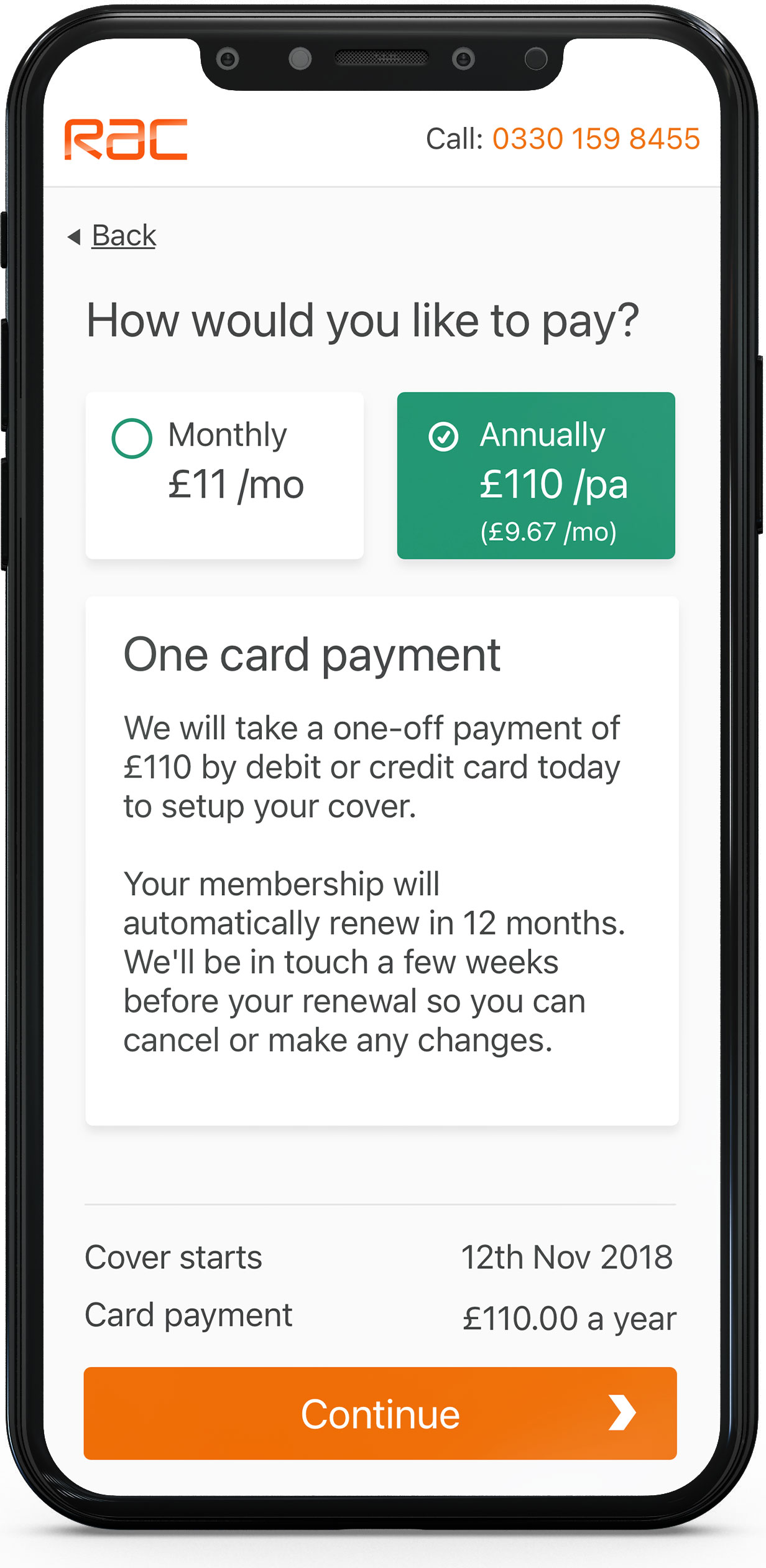
The use of language and tone of voice was a large factor in reassuring the users the were doing the correct thing. Things like:
Throughout the sprints, regular user research sessions and findings workshops were held, enabling the team to alter the designs before producing the next prototype and testing it again.
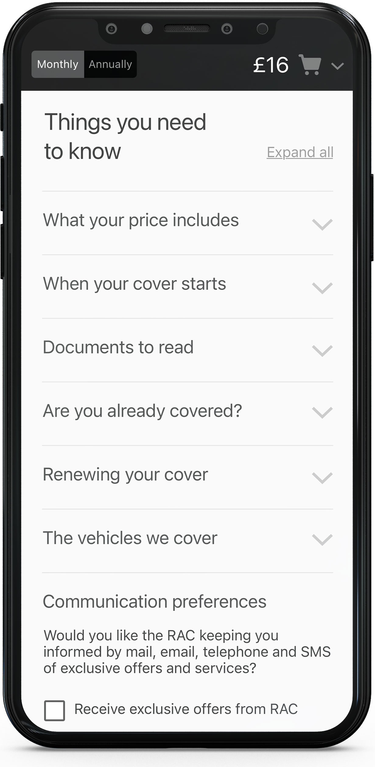
It also became clear through the research and the user testing that certain areas weren’t performing as well as they should on mobile. Several “read more” functions when opened were very long which led to a lot of scrolling. This was reduced for to be more succinct.
Conclusion
By improving the users understanding of the products and informing them of their decisions and there current total, whilst giving them the option to review a monthly or annual price at any time, the users felt reassured that they were in complete control and they knew exactly what they were buying and how much it was going to cost.
Additionally, by altering the tone of voice and addressing some more technical issues, the challenge of achieving a 95% checkout to completion target was met and subsequently, further sprints were made on the desktop views.
I’ve had the pleasure to work on a great number of projects, but some of them can’t be shown publicly. Please feel free to get in touch if you’d like to see something that isn’t here.